Introduction
Branding & web design for medical technologies provider.
Medical Imaging Technologies produce proprietary devices and software, designed to meet specialised requirements for healthcare professionals.
Although an established business, no clear branding had been established at its inception. As a result, a number of product lines had developed their own discreet identities. This lack of a coherent style undermined the breadth and scale of MIT’s commercial offering.
A new brand identity was needed bring together the various aspects of their business operations and position MIT as a credible, contemporary, leading med-tech provider.
Adobe CC
Primary Logo

The client decided on a logo device based on an infinity loop, representative of their products role in patient data collection, storage and transfer integrations for PACS systems. A soft teal and grey palette was chosen as most appropriate for marketing to the healthcare sector.
Secondary / Reverse Logos

For use in layouts where vertical space is limited, a horizontal lock-up was prepared as a secondary option. In reverse application, both primary and secondary logos are reproduced in mono to avoid issues with gradients in the loop device.
Alternate Logos
Sitemap


Web


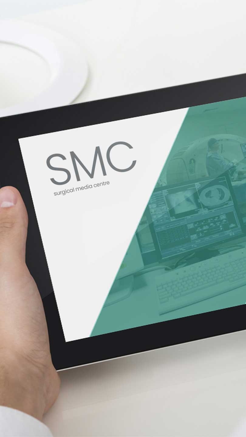
Product Marketing


Print Collateral

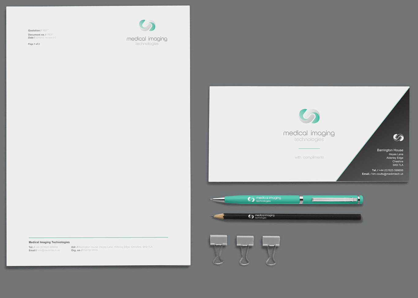
A full set of print collateral including stationary and merchandise was designed for the launch of the new brand, along with style guides for its application to future events collateral.