Introduction
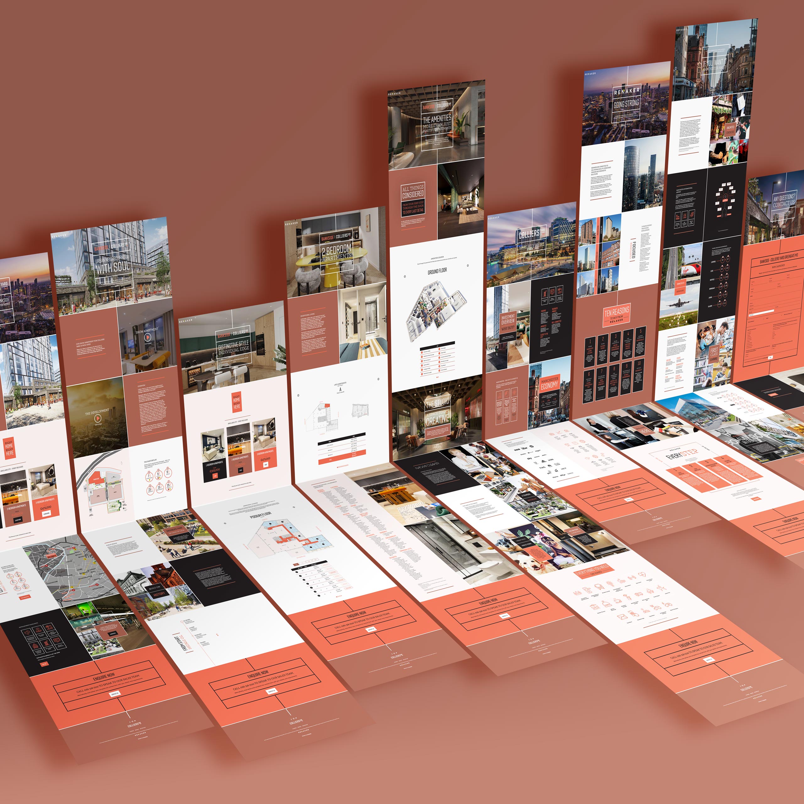
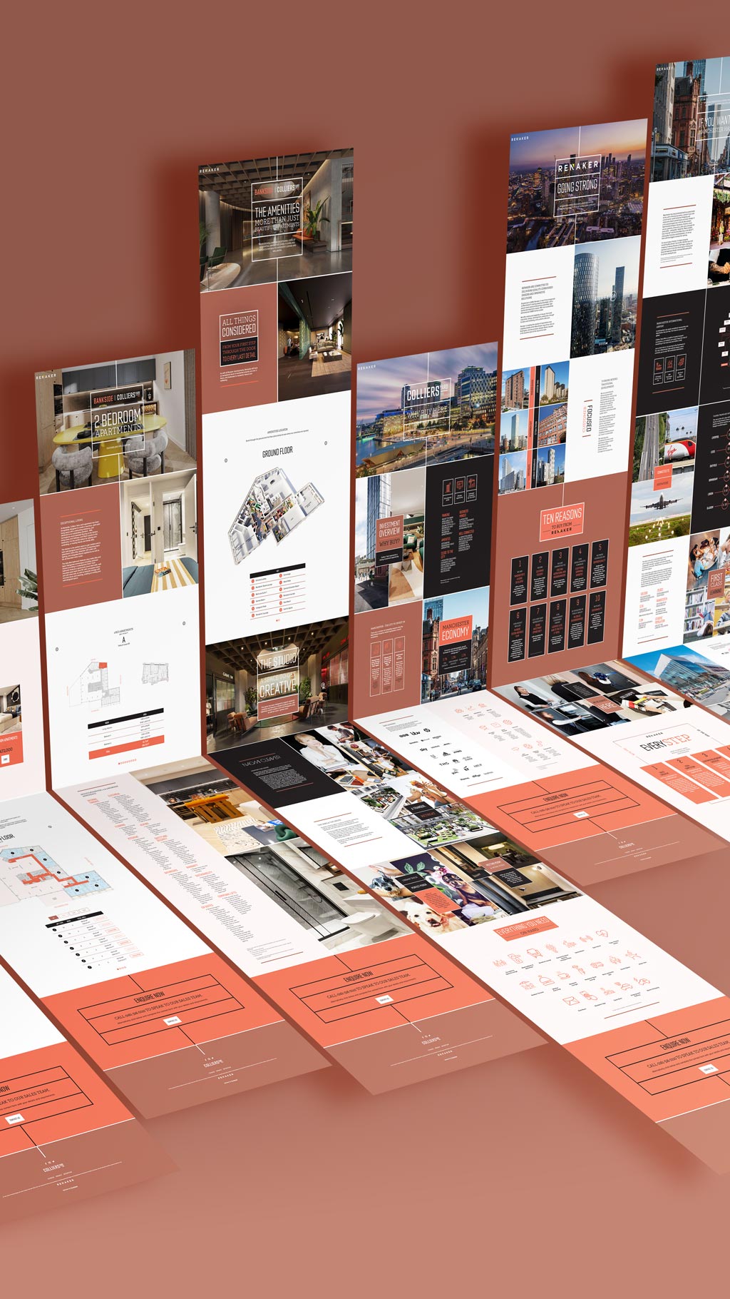
Prior to the release of plots in the first phase of the build at Colliers Yard on the northern border of Manchester city centre, Renaker commissioned a new, dedicated site to provide information to prospective buyers and drive sales enquiries.
Basic brand guidelines had already been produced and applied to some initial marketing collateral including site hoardings and social channels, but with limited content and no set design system. Following discussions with the client to establish project scope and consider the existing / potential content, a site plan was generated and preliminary content architecture drawn up. This process informed the subsequent development and extension of Colliers Yard brand style.
Site design was carried out in iterative phases with a focus on reusable and variable components to reduce build time and allow for the inclusion of additional content / content types following launch.
Adobe CC
Interactive Design
Code & Dev Tools
Platforms
Fonts


Brand guidelines specified two typefaces for primary and secondary headings, Countach and Adelle, both in marked contrast to Proxima Nova, selected for its legibility in body copy at smaller point sizes.
Palette


Colliers Yard palette was chosen for the red brick materials of historic buildings on the site, from which the name is also taken. Each of the three primary colours has its own theme which are rotated in sequence fro one section of content to the next.


UI Components


Icons