Hot Property
Scroll Down
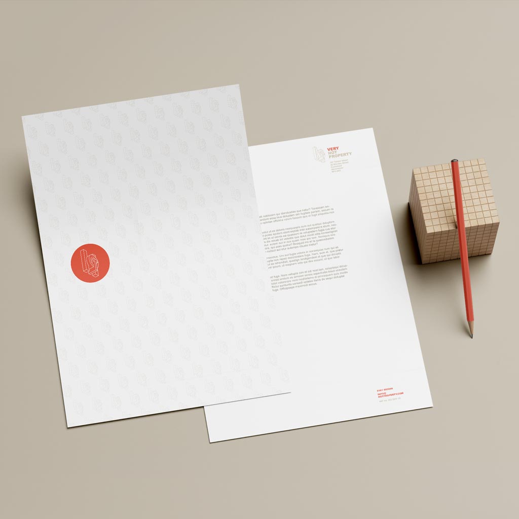
Branding
Introduction
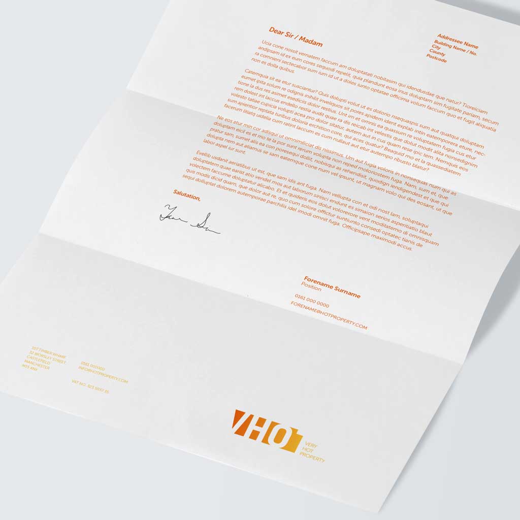
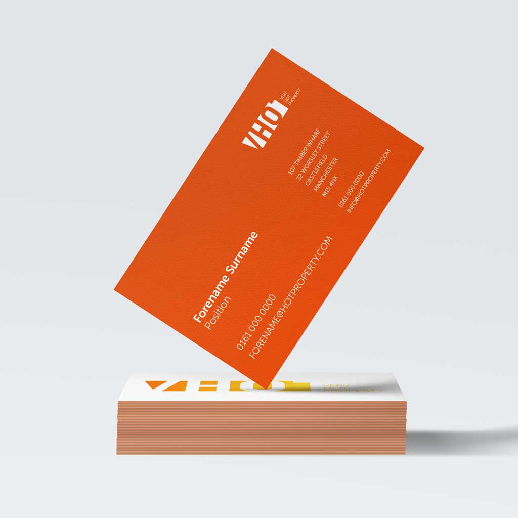
Brand proposal for property sales and lettings group.
With the intention of launching a new sales and letting arm to market their properties directly to the public, the client, a constructor / developer, requested a brand proposal demonstrating a series of potential options.
These options were to be visually independent of the existing group brand, with the only stipulation being the names Hot / Extremely Hot Property.
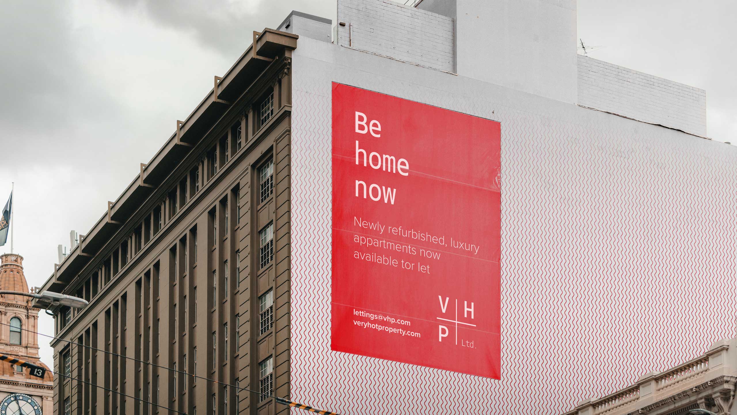
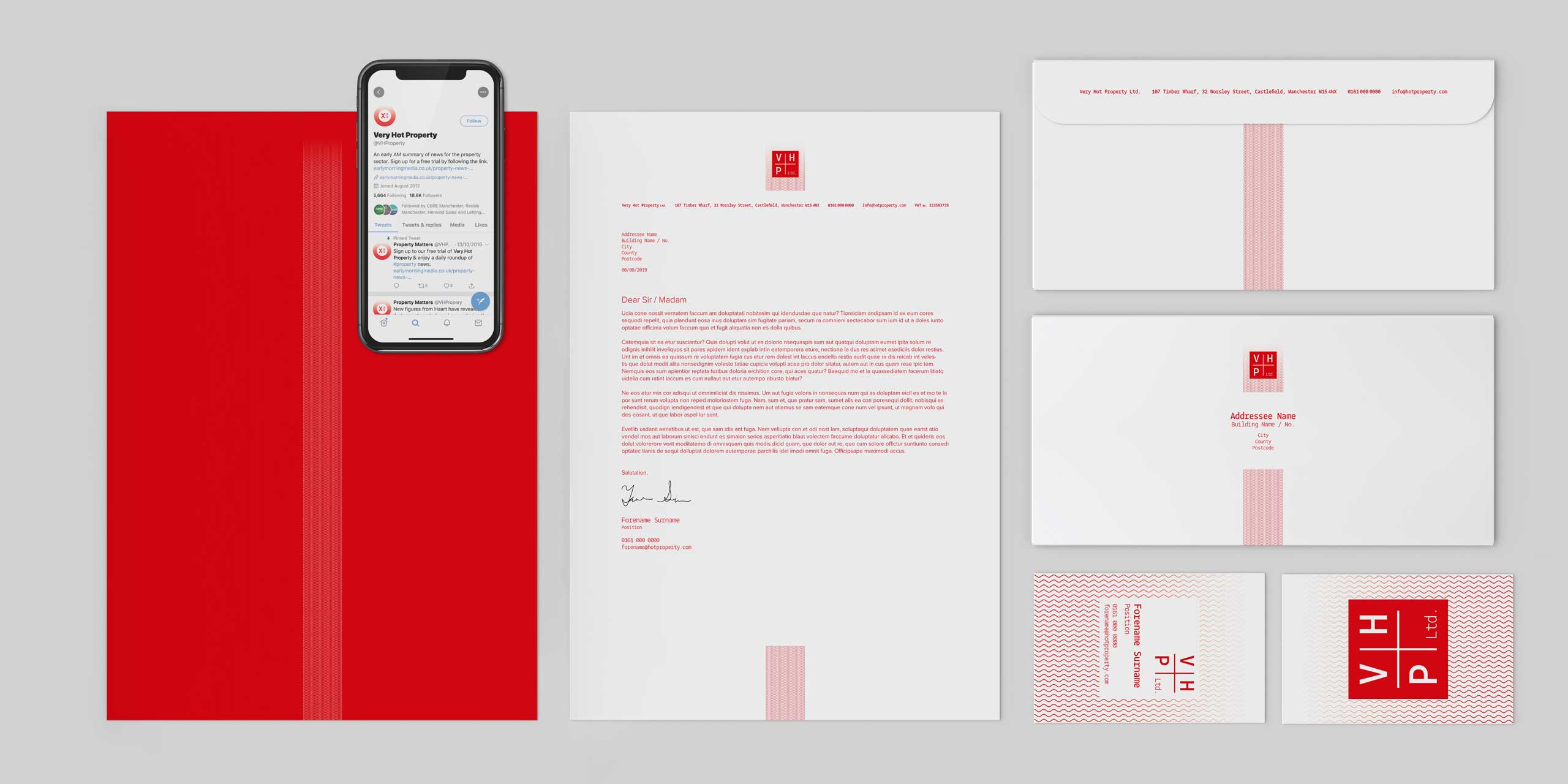
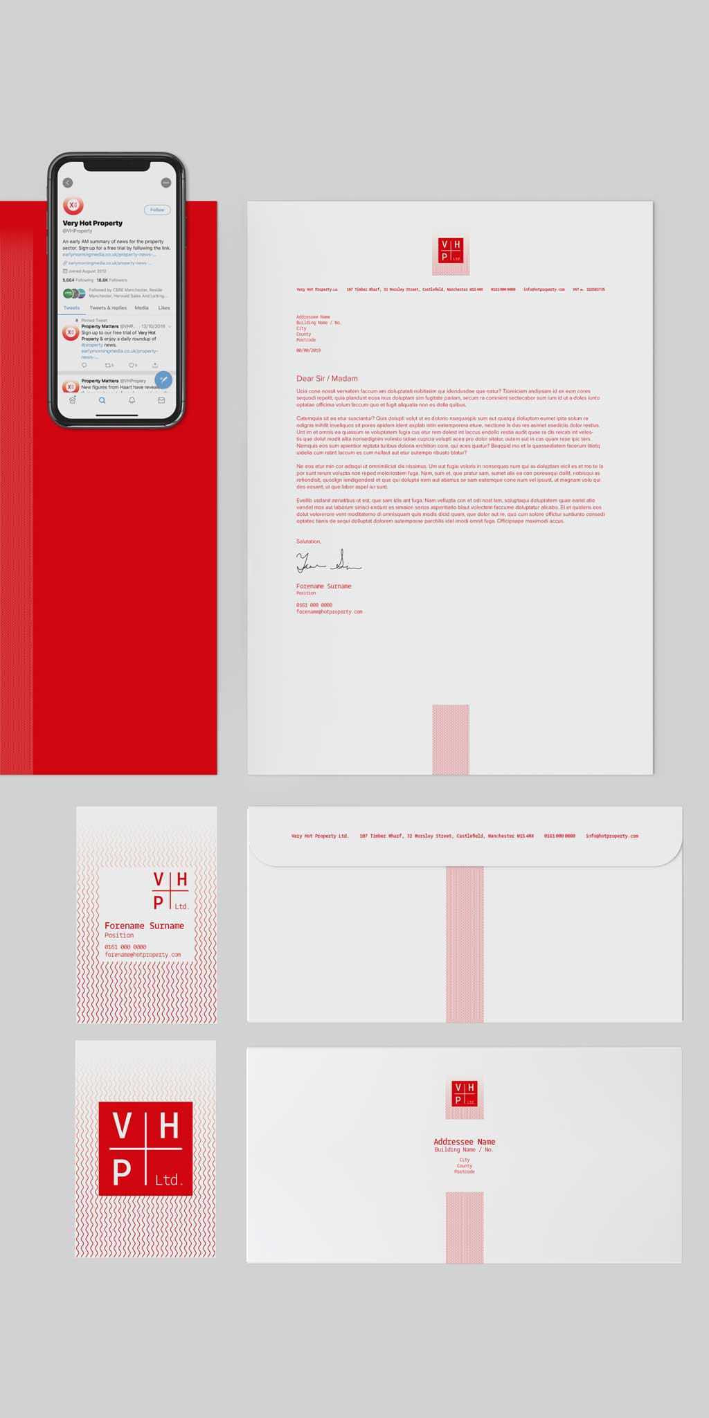
Option 1 – Wave


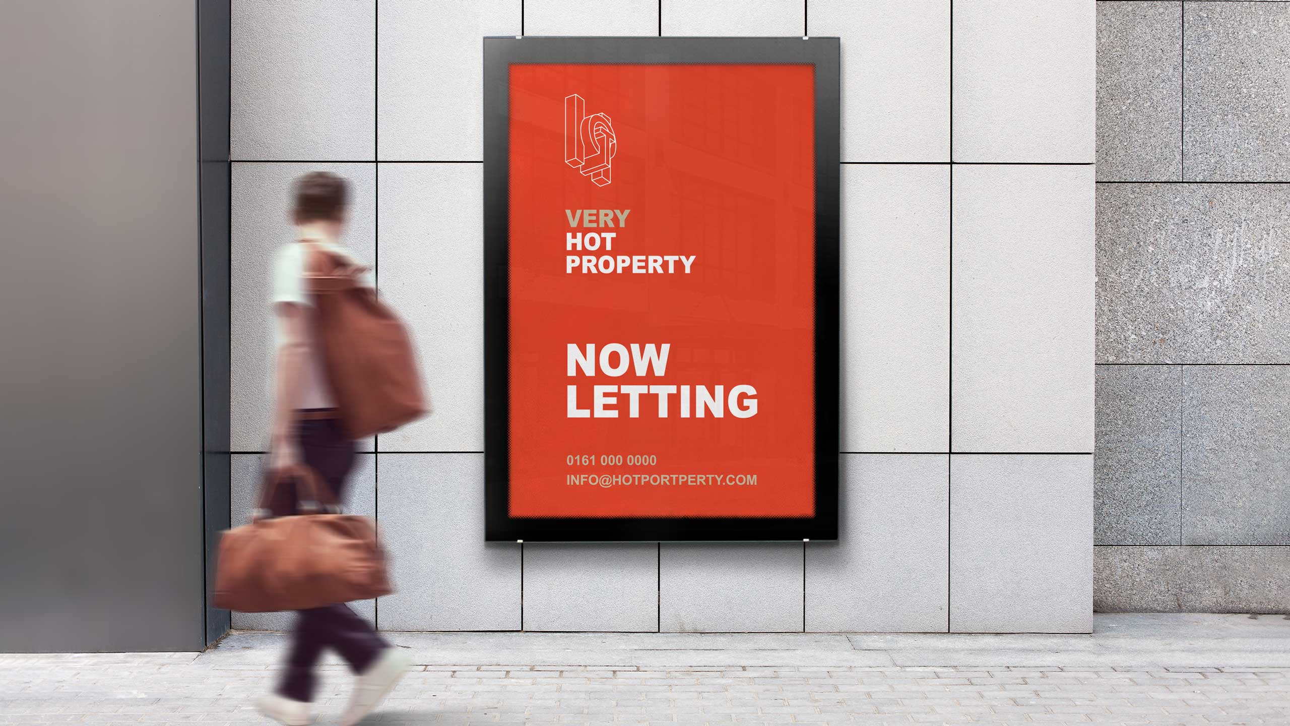
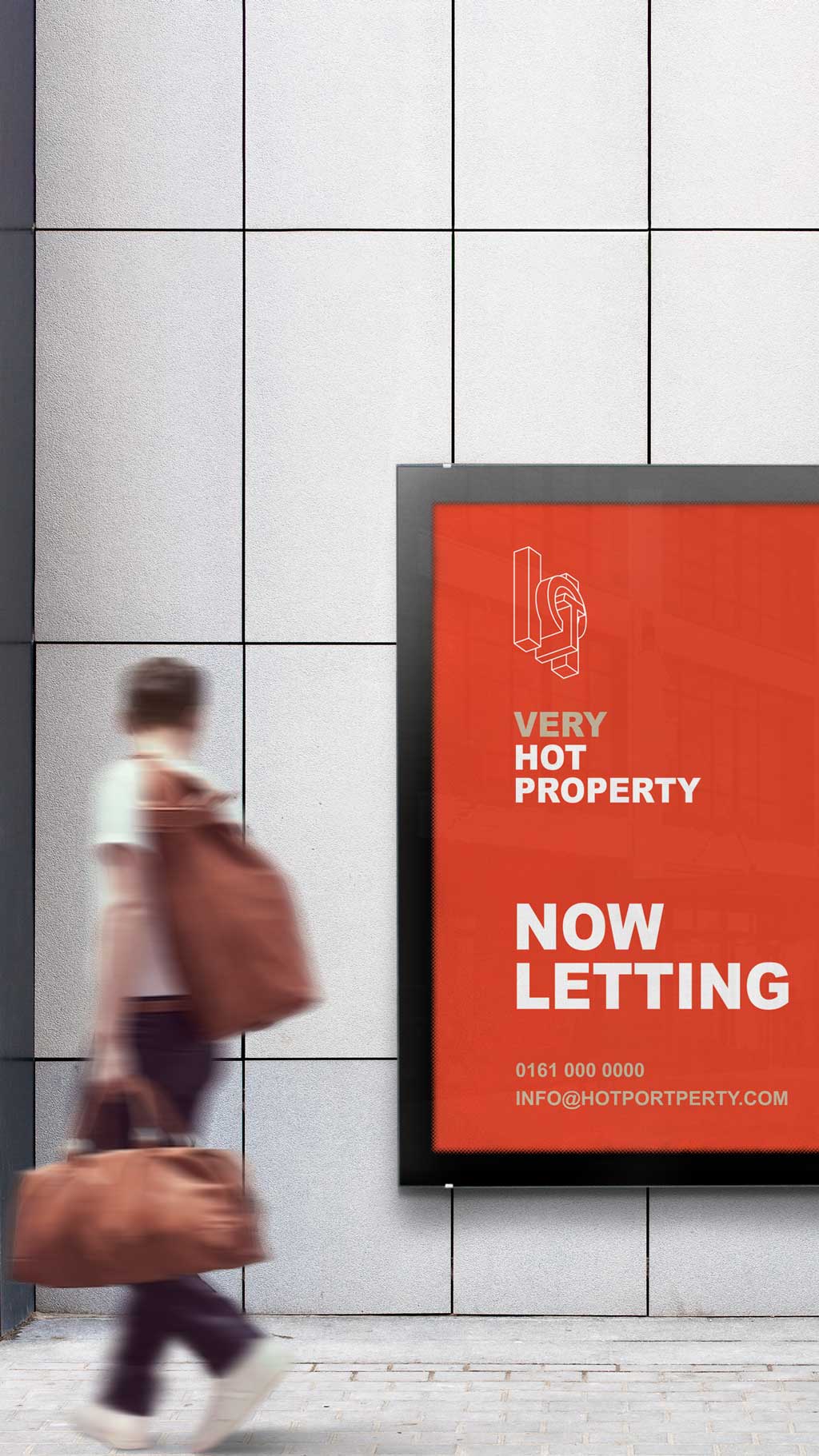
Option 2 – Geometrics
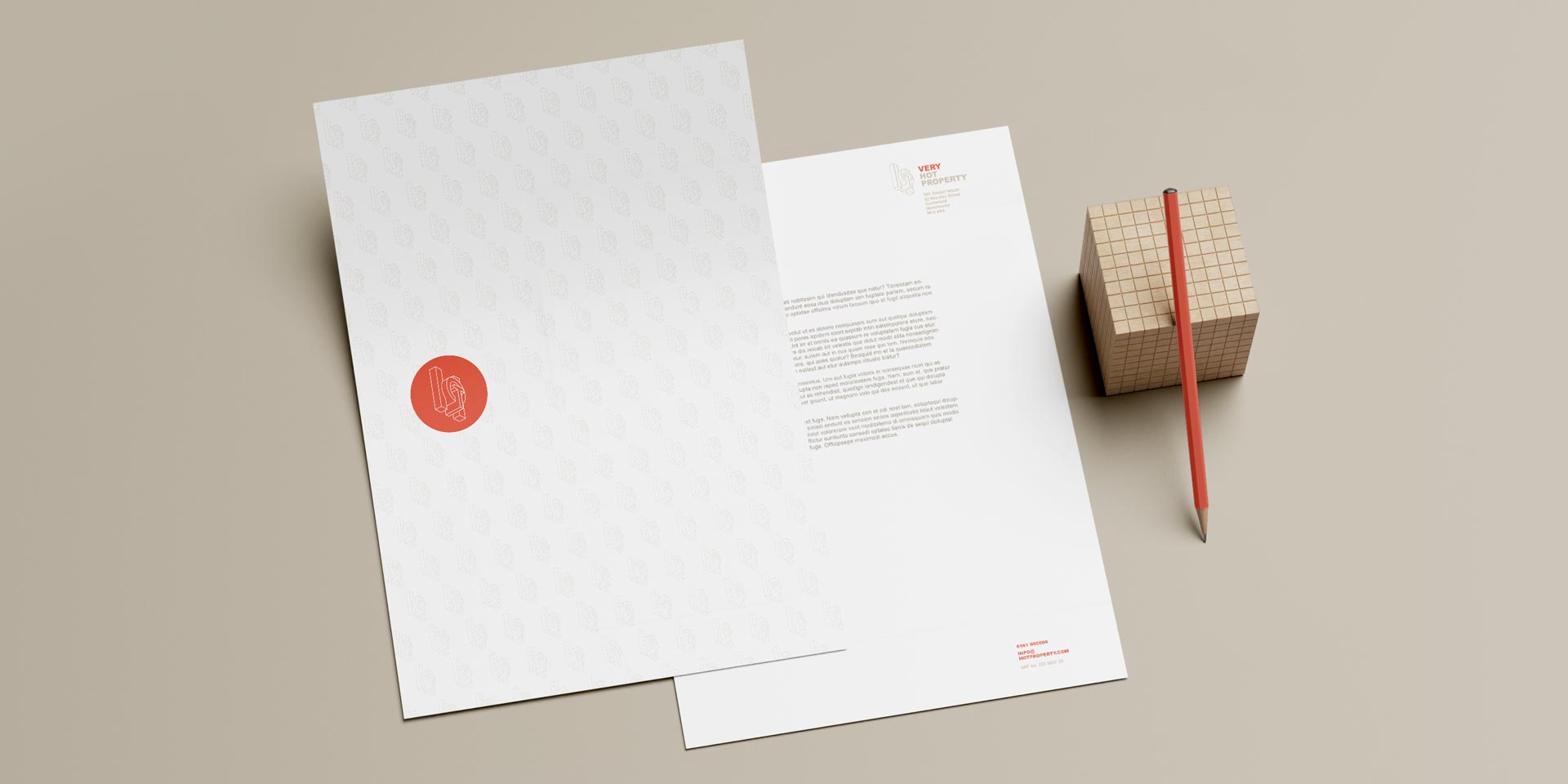


Option 3 – Exclusion Mask