Introduction
Hollins Murray Group required a complete rebrand, including guidelines and application across company-wide collateral, web and physical assets.
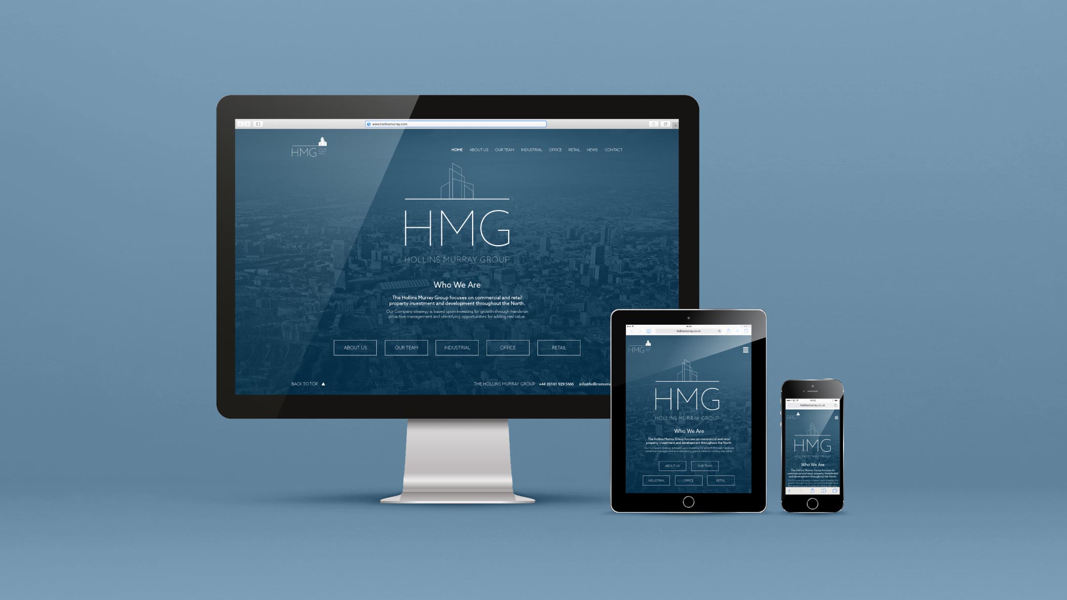
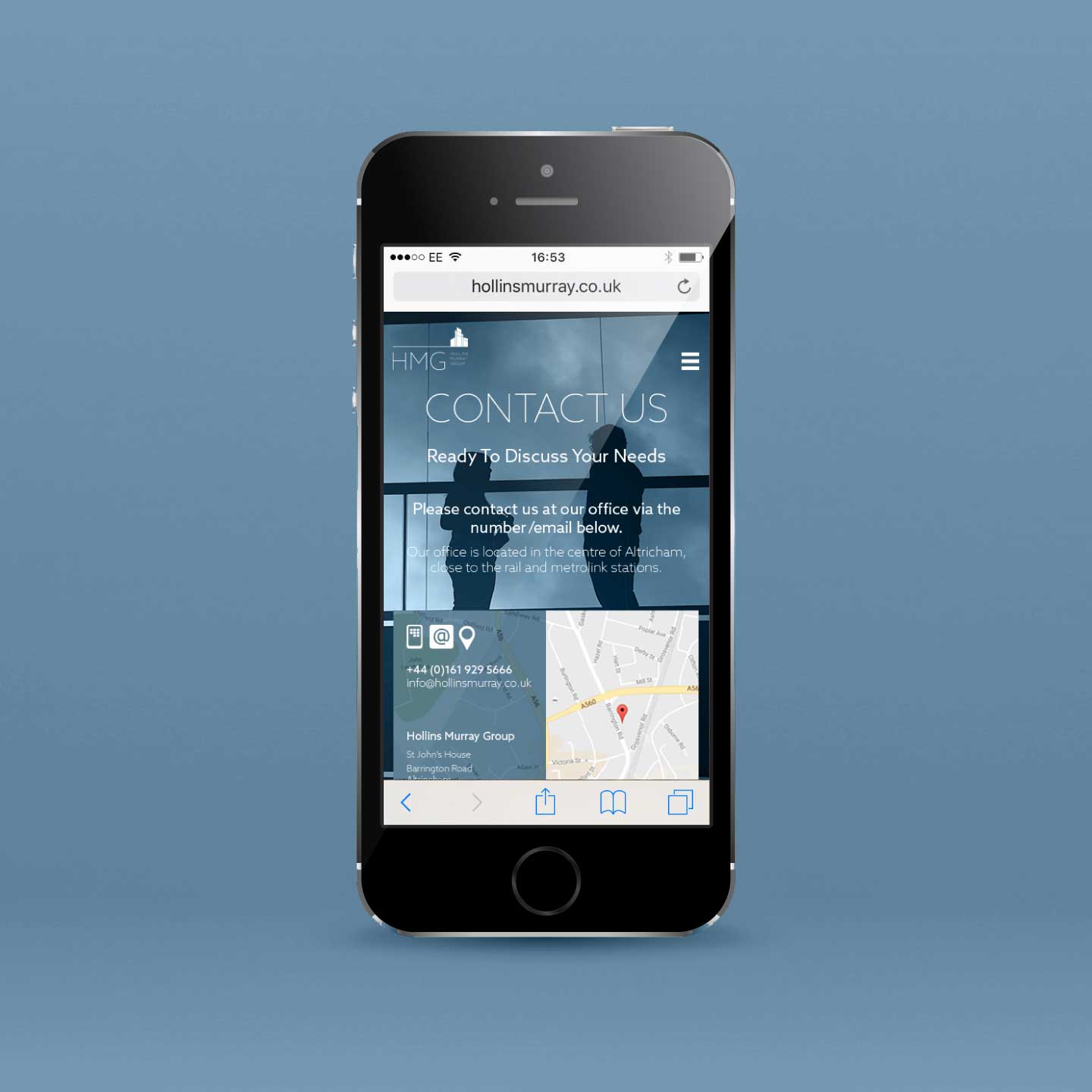
Prior to the rebrand, the company website had not been updated for a number of years and was using a fixed width layout without any mobile optimisation. Before the redesign began, the client’s needs were assessed to assure a suitable CMS would be supplied and that the property search UI features were made as accessible as possible across all devices.
Primary Logo
The client decided on a minimal logo based around thin fonts and strokes, conveying a more contemporary appearance to better fit their tone of voice as a high-value operator within their field.
Secondary / Reverse Logos
The secondary, vertical lock-up sees all elements centrally aligned for better visual balance. On reverse application the stroked elements of the logo are inverted to solid vectors to improve legibility.
Alternate Logos
Fonts
Keep with the brand’s minimal aesthetic approach, only two weights of a single typeface, Azo Sans, are used across all media and materials , with web safe fallbacks limited to Arial and Helvetica.
Palette
The previous palette used highly saturated and vibrant blue and orange swatches. To retain some brand continuity, the blue was retained, but in a more muted, sophisticated tone.
Web


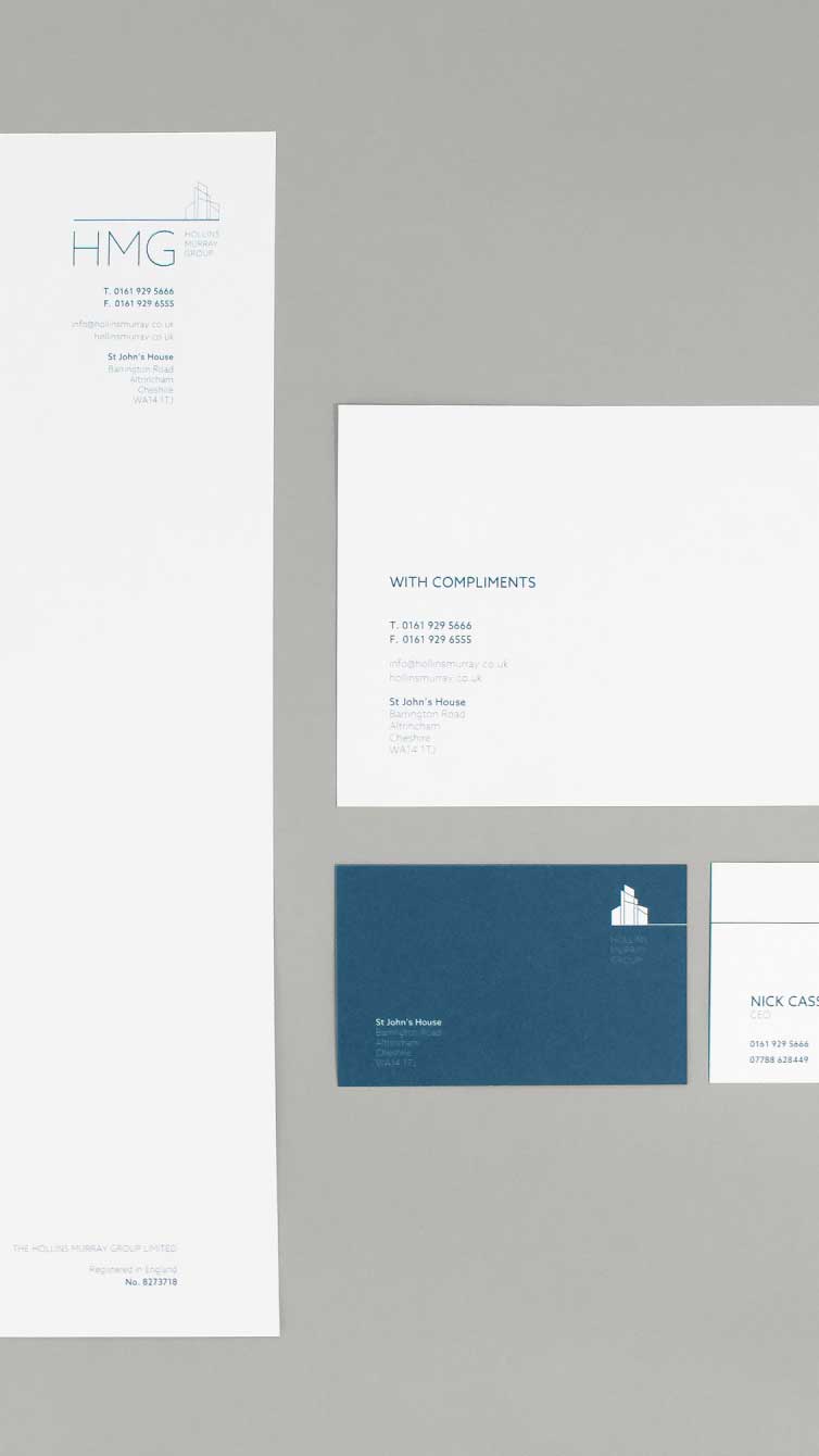
Print Collateral


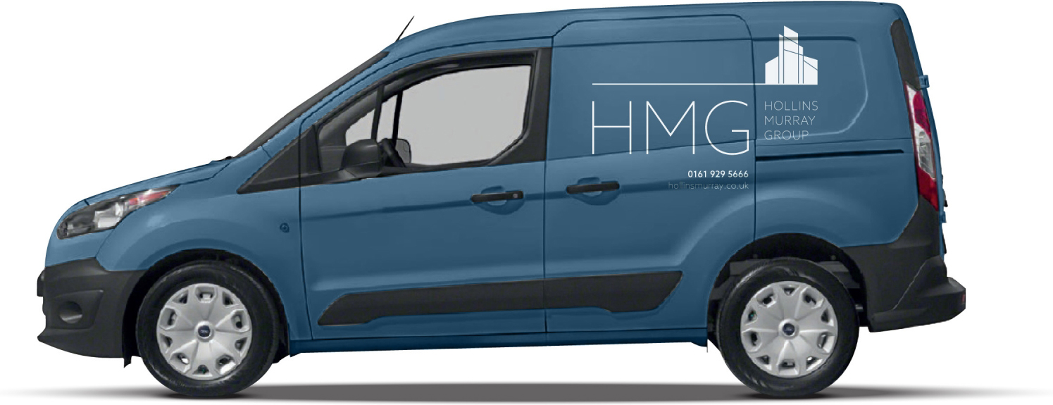
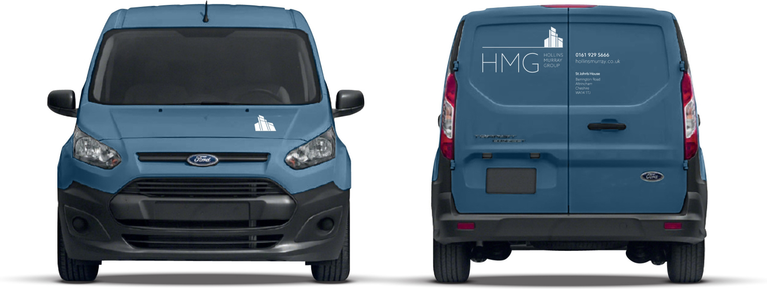
Livery
