Introduction
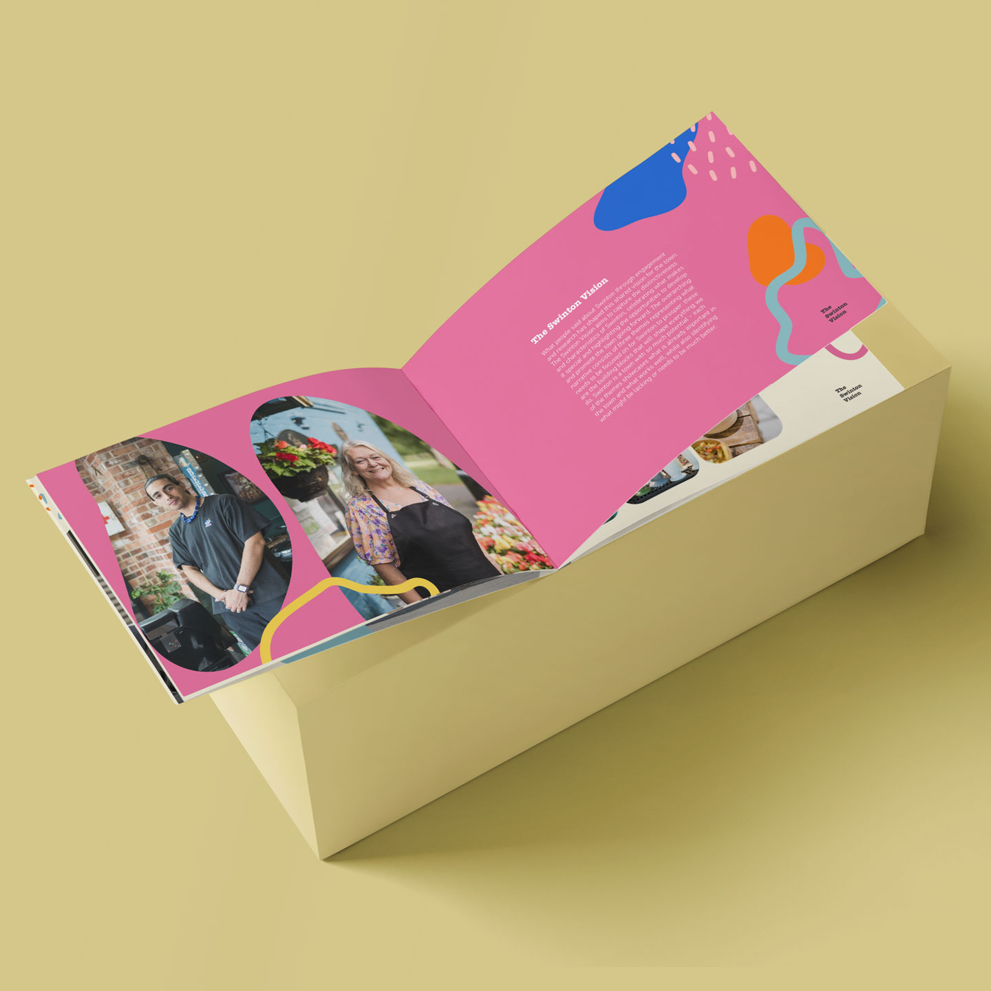
Salford City Council appointed placemaking specialists Thinkingplace to develop a distinctive vision for Swinton. From November 2021 through to April 2022, they engaged with a wide range of local community stakeholders including residents, businesses, schools, young people and community groups.
A brochure and associated print collateral were produced to explain the findings of this research, state the council’s intention toward the redevelopment of the area and outline how they propose to move forward.
The Council requested that these materials be given a style that was sympathetic to their standard branding, but distinct in its own regard.
Adobe CC
Fonts


To avoid aligning with Salford Council’s own branding, a softer, more community oriented slab-serif was introduced for headings. Body copy, however, was kept inline with the council’s use of DIN to ensure all applicable accessibility and legibility standards were met.
Palette

Similarly, the pervasive use of magenta as the primary accent colour in the council’s brand was avoided, with a broader pastel palette produced around a similar, but softer pink hue.
The secondary swatches were selected so that they could be used interchangeably in (almost) any combination, allowing for as much flexibility as possible in future use.


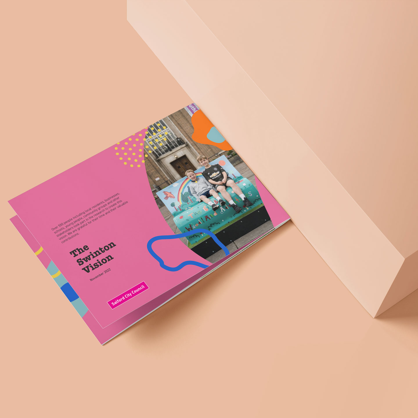
Alongside an accessible PFD version for online use, a short run of brochures were printed and distributed in civic / shared spaces throughout the redevelopment area as part of ongoing public relations activities.
Graphic Devices


