Introduction
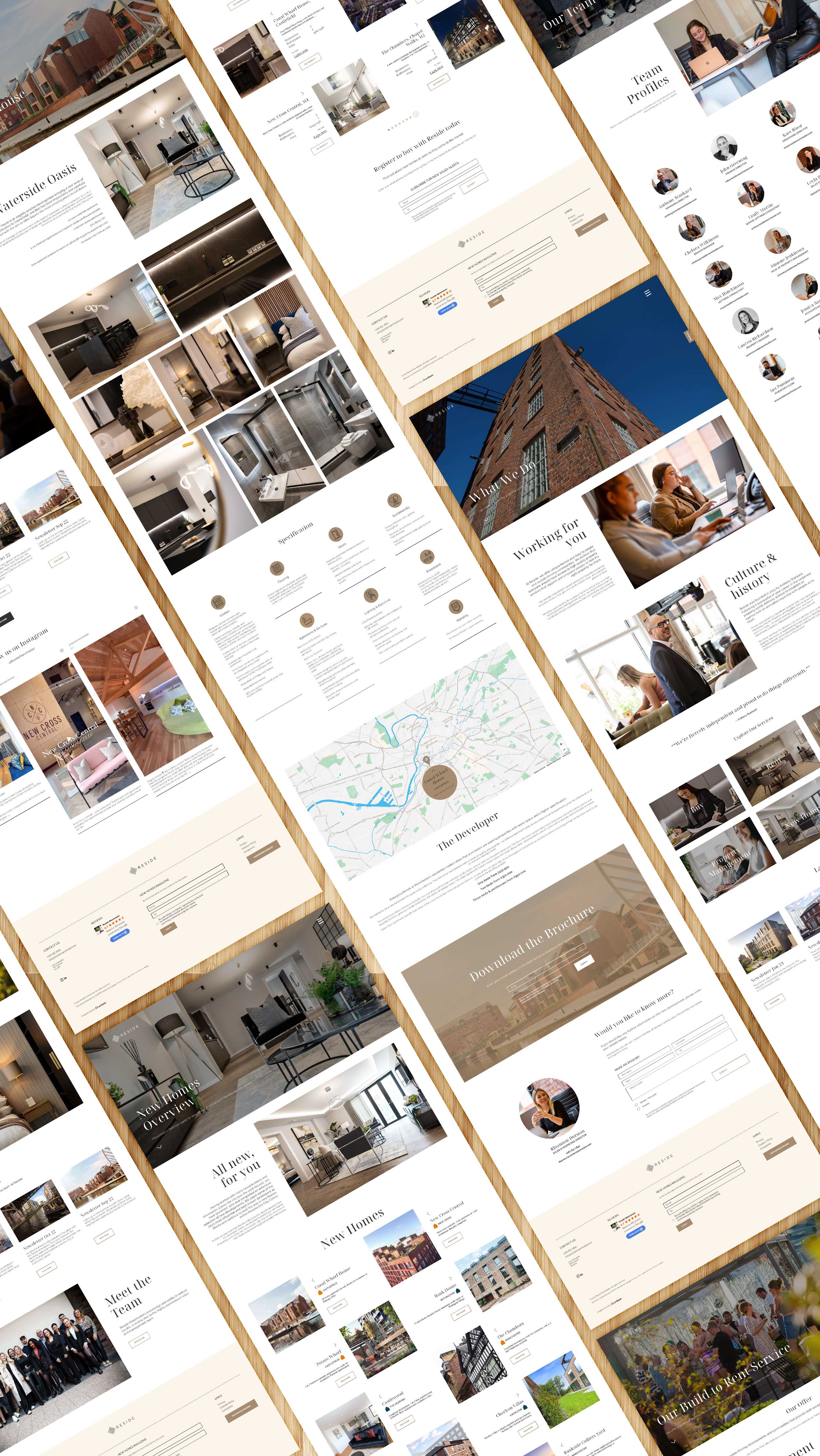
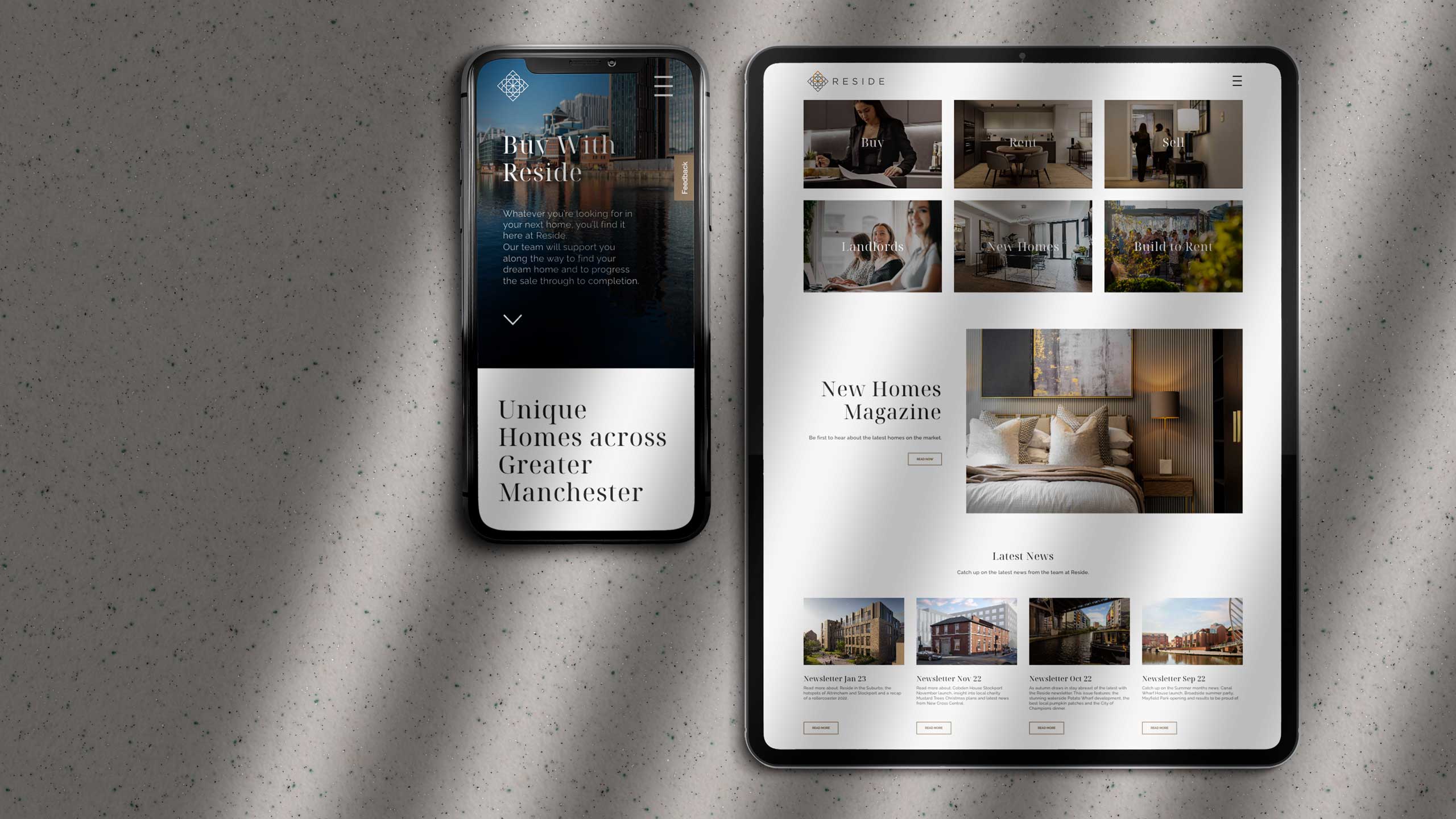
Following a brand refresh toward a more minimal, editorial aesthetic, Reside required an updated website. New fonts and a more subtle palette were used to convey a more high-end, less commercial aesthetic, better fitting the client’s aspiration to position themselves as a leading agent for luxury property portfolios.
Wireframing and initial prototyping were carried out in Figma, with approved layouts and atomic components handed-off to dev for a WordPress build utilising custom Gutenburg blocks with ACF.
During the redesign, the opportunity was taken to revise the CMS in order to better integrate it with their CRM, removing the necessity for manual duplication of data entry between the two.
Fonts
During the brand refresh a more elegant typeface, Noto Serif Display, was introduced for headings, with the existing Raleway typeface retained for paragraph elements. A variety of weights and cases of the latter were used to distinguish between a variety of content types.
Palette
Reside’s original palette made heavy use of the colours present in their logo, with orange used heavily for graphic and interactive elements and mid-grey for copy. As part of the new, more refined aesthetic, the revised palette features more muted cream and bronze accents. Copy is presented with more confidence in a much stronger, darker grey. The three legacy tones are reserved for exclusive use in marketing materials beyond the website.
UI Components
Layout


