Introduction
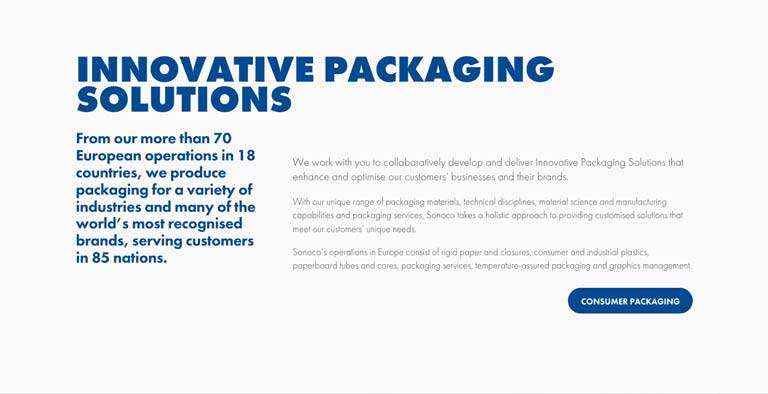
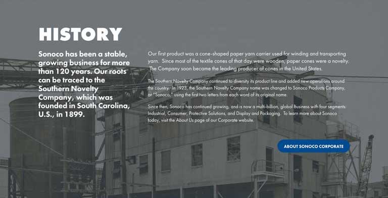
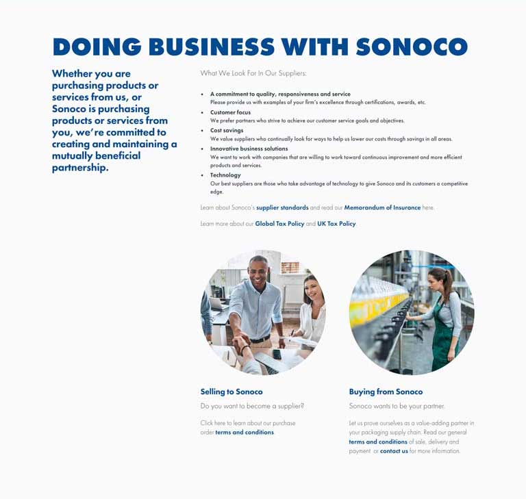
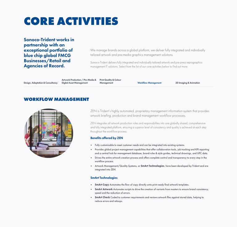
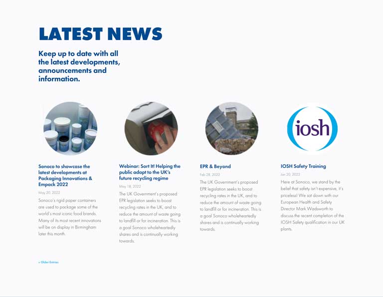
Sonoco required a complete redesign on their regional website for Europe. The existing site was disorderly due to a fragmented build, with numerous additions made at different points and in conflicting styles. The brief was to rationalise the site aesthetic, creating a consistent presentation of the brand, while differentiating it from the US parent site.
Prior to the design process, content architecture was reviewed and revised navigation proposed to aid UX.
Fonts
Font use was limited to a single typeface, ensuring the style was inline with the brand logotype and copy retained a consistent style across the site, regardless of historical differences between content provided by or related different corporate divisions.
Palette
As with fonts, colours outside of the corporate brand palette used by specific divisions, departments and sub-brands were removed to promote a unified UI.
Layout


